Automated accessibility testing gets you on the way, but doesn’t find all the problems
Testing your products for accessibility issues is a tricky thing. Your users have all kind of different needs and setups. They use computers in ways that appear daunting to you and hard to replicate. Any sighted person that used a screen reader to test their products can verify this. Often we turn off the sound and rely on a text log of the screen reader or an on-screen display.
The problem is that we’re not used to interacting with our products in others ways than our own. There is a high chance that we’re doing things wrong when we emulate how a certain group of users would interact with our product.
Assistive technology is complex. There are, for example, dozens of different keyboard interaction patterns to learn when you use a screen reader. This isn’t even an accessibility problem. It is incredible to see users in tests consume your products in ways you never thought of. And it is painful to see how often things that you consider “obvious” and “easy” are a barrier to a lot of people.
The best case scenario is that you have access to a diverse testing team who can bring these other points of view and experience for you. In my job, I am lucky to have a dedicated team of testers with different abilities and setups. Bug reports come with videos of them using the product and information where they get stuck. But not everybody has that opportunity. And it still means that it sometimes is hard for me to replicate the process.
Often you find developers using automated systems to run a quick test on their products to find the most obvious problems. Which is good, as it means you find the lowest hanging fruit and can deal with them. That cuts down the list of bugs that the real test team has to deal with. But, accessibility testing is interaction testing, and this is where automated processes fail. Many accessibility issues only show up when you start interacting with the product.
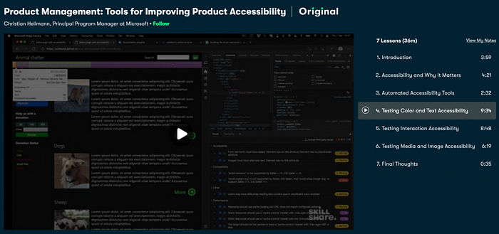
I am explaining this in my Skillshare class on accessibility. You will find that a lot of accessibility issues only show up in interaction.
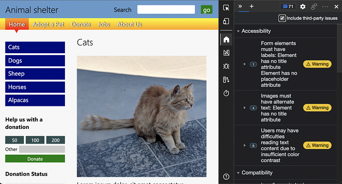
Take for example the demo page of the class:
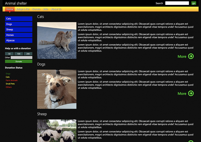
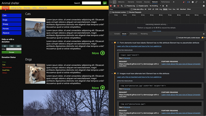
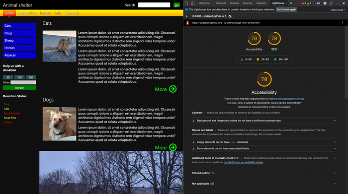
An automated test will discover glaring accessibility issues. Missing alternative text on images, missing form labels and also contrast issues.
The Issues panel in browser tools for example shows these.
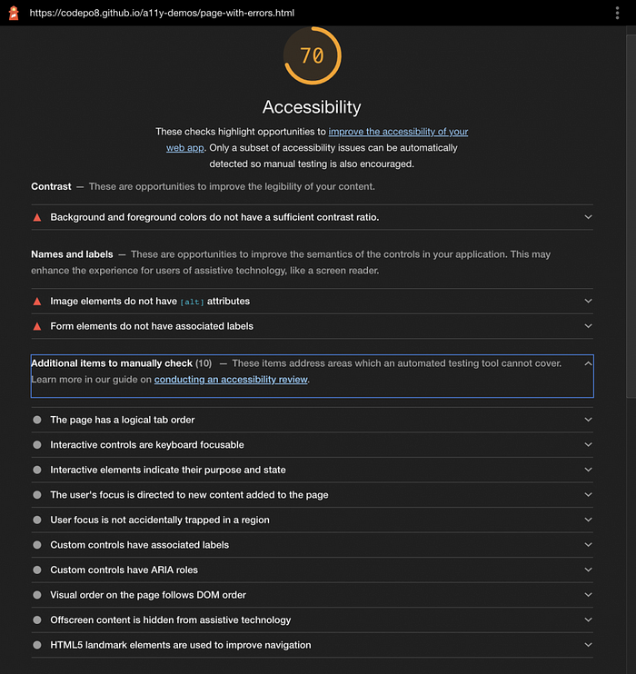
If you run a Lighthouse audit on the product you also get them.
And Accessibility Insights fast-pass also flags up these issues.
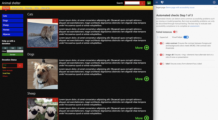
Each of these gives you a false sense of success though. Because when you look deeper, there are still some obvious issues to fix.
While automated systems correctly flag up the search form as a problem, they ignore the donation form on the left hand side.
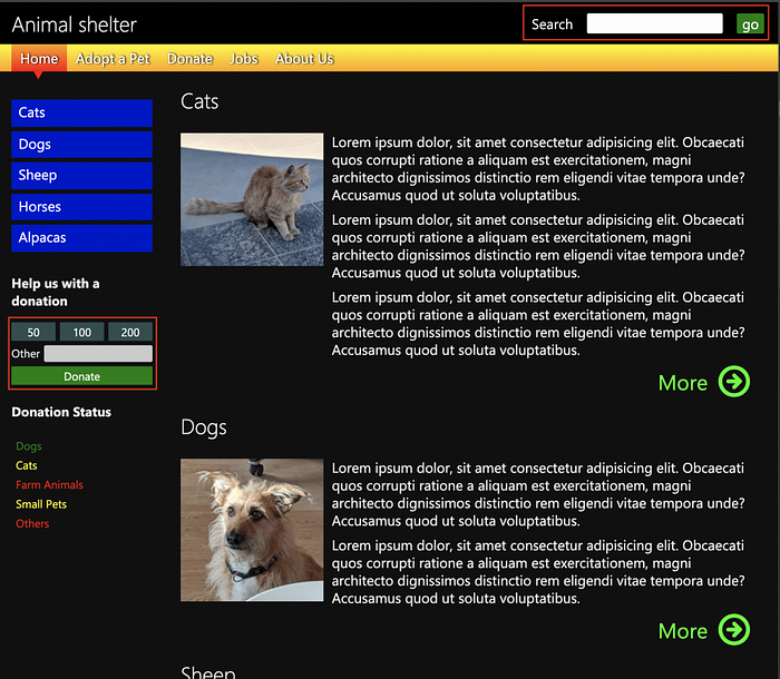
The donation form has a label associated with the form field which means it passes this test. But, all the buttons in that form are DIVs and have no meaning to assistive technology. You can’t even access them with a keyboard. You can test that yourself by trying to tab to it. All you can access is the form field itself, but you can’t even hit `Enter` to submit the form as there is no submit button.
Using a keyboard to navigate the document is the best way to find out about these issues. You can also gain some insights by checking the accessibility tree. Or by using the Inspect tool to find out if the element is keyboard accessible and that it has a name and a role.
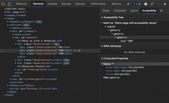
The Inspect tool shows in a more obvious fashion that the element has no name and only a generic role and that it isn’t keyboard accessible.

Another problem that an automated test can not detect without extra effort is different changes in mode. For example, in the dark scheme of the page the Issues panel reports 2 contrast issues.
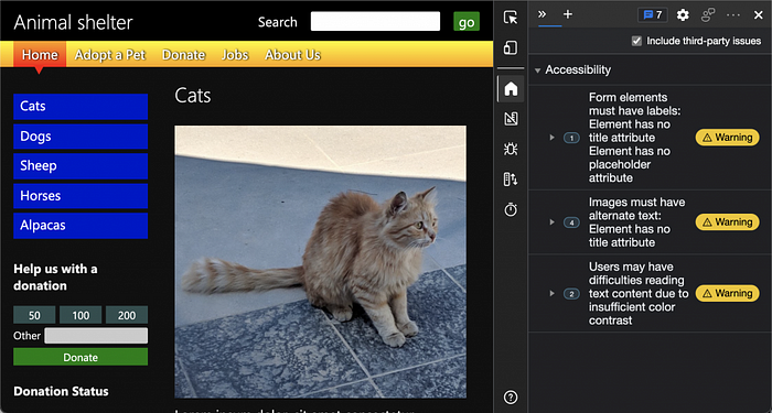
When you switch your OS to light mode (or use the emulation in developer tools) you will find that there are six contrast issues.
This proves one thing: the earlier in the process of your product you take accessibility into consideration, the better the result will be. Any interaction is a possible accessibility barrier and needs to be flagged up for testing.
Experts know that. In a survey of Web Accessibility Practitioners 17.6% stated that only half the accessibility issues can be detected by automated testing.
The interesting thing is that tools even point that out. If you expand all the information on a Lighthouse Audit report you will see that the tool mentions that a lot of manual testing is needed. Question is, how many people even went that deep down the rabbit hole and looked closer when the accessibility score was already high enough?
A few years ago Manuel Matuzovic proved in a — admittedly contrived — example that you can create a fully inaccessible site with a 100% score on Lighthouse.
The main thing to remember is that automated tests are a great way to get started and find the most obvious flaws. But they are not the end of the process if you really want to create accessible products.
Want to learn more? Check out the class on Skillshare where — amongst other things — I talk through this process of moving from automated to manual testing.
